Designing Fluid Interfaces
Designing Fluid Interfaces
WWDC 2018

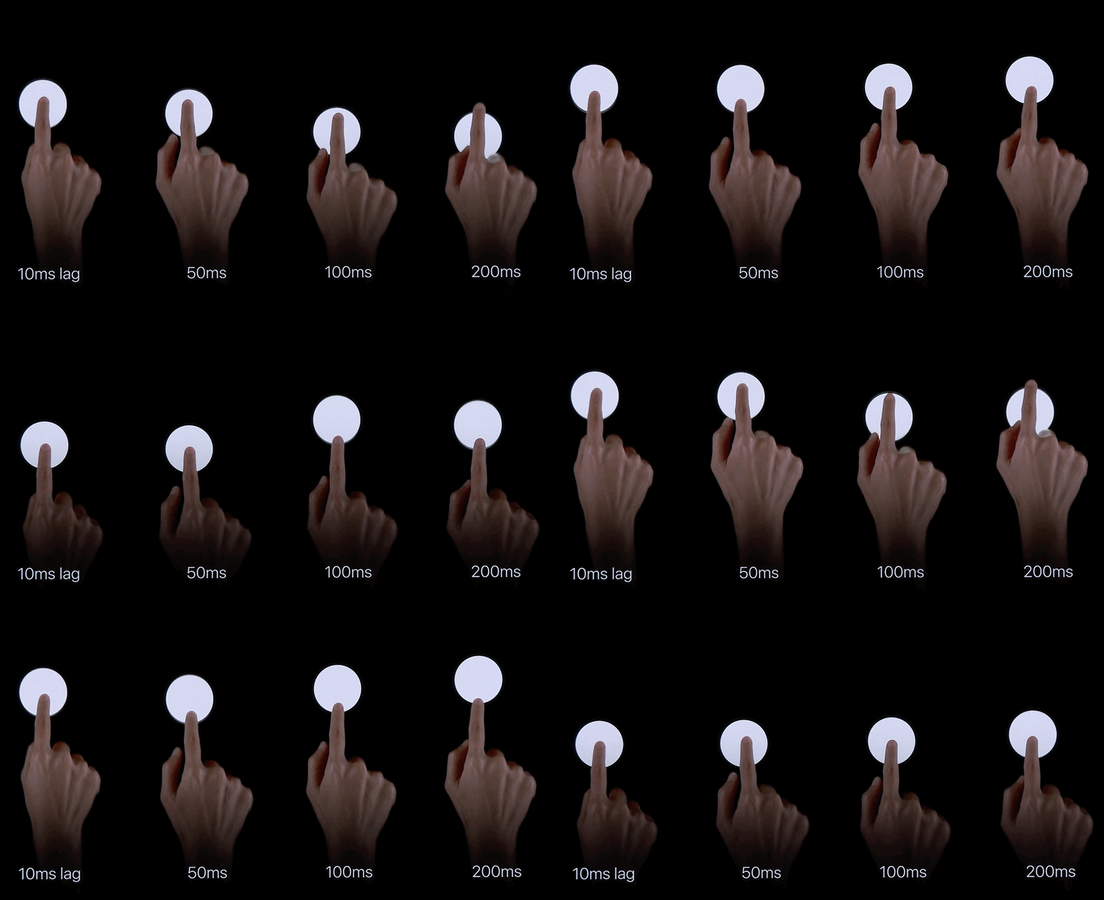
Respond to input instantly
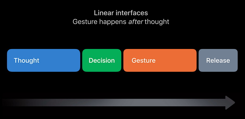
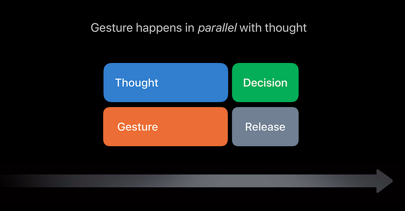
Gestures in Parallel With Thought
- Faster than thinking before doing
- 1 gesture solves multiple problems
- Helps with discovery
- Allows you to layer gestures at the speed of thought
Respond to redirection as fast as possible
- Allow for constant redirection and interruption
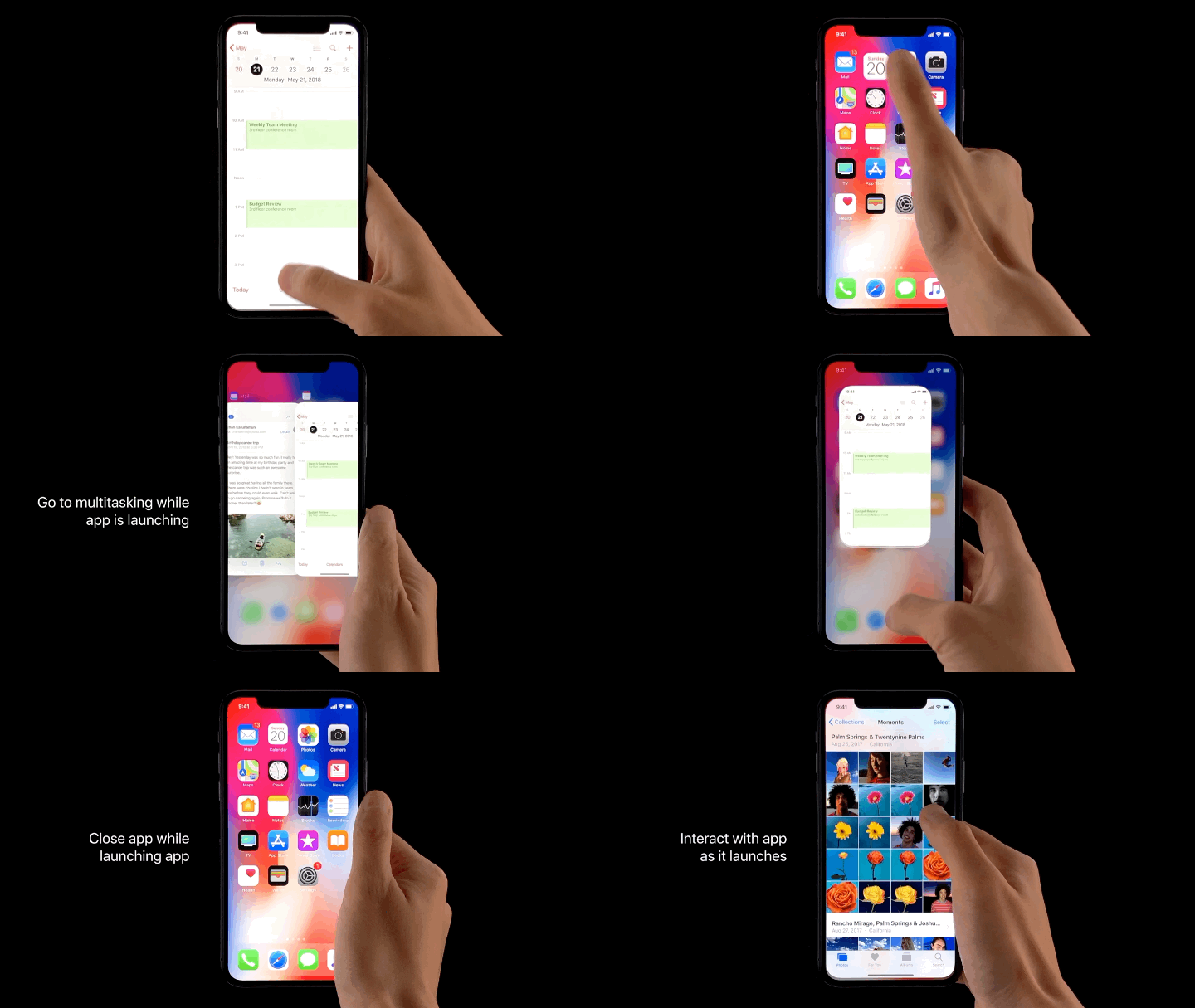
- What if it wasn’t redirectable?
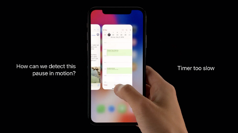
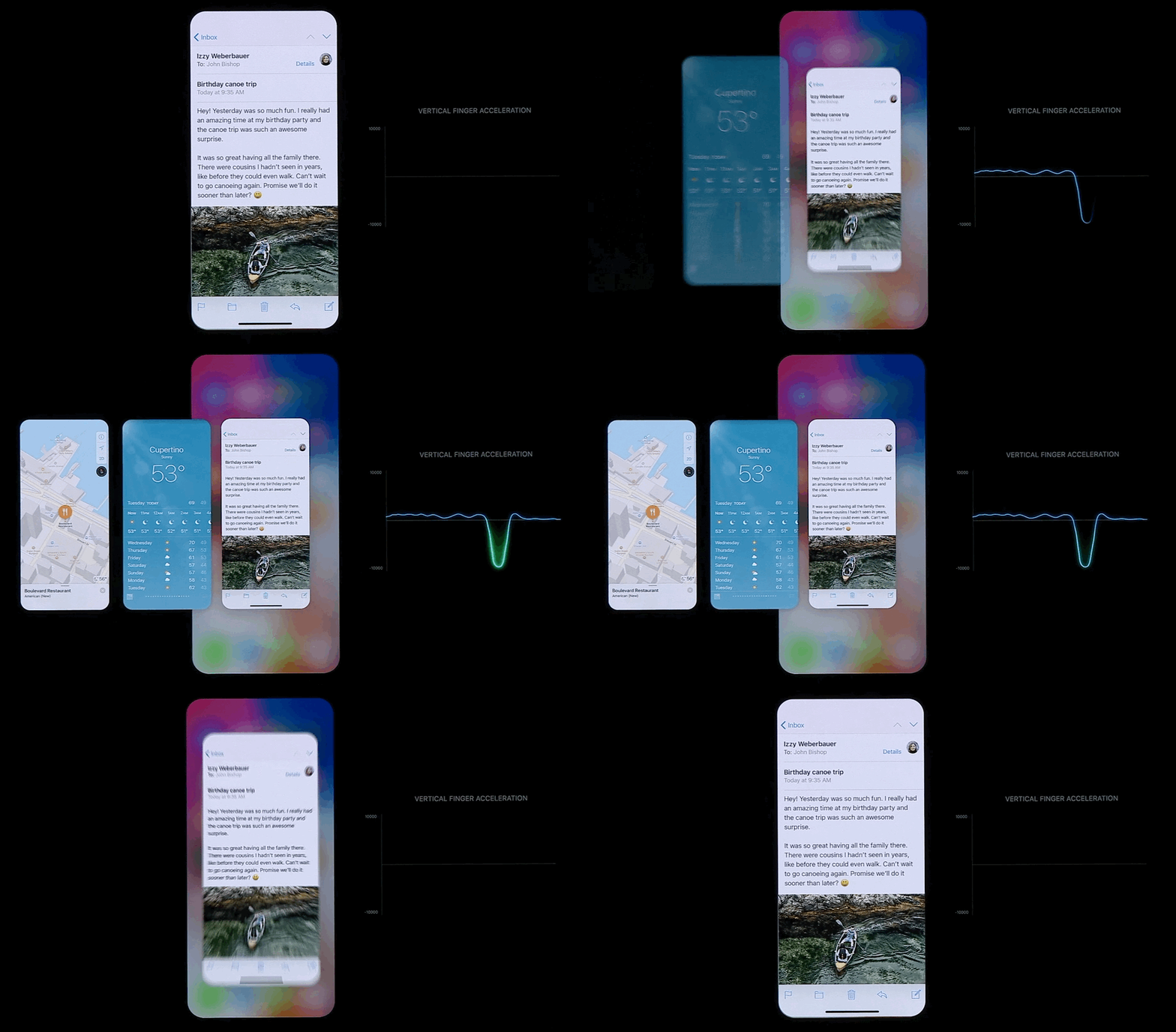
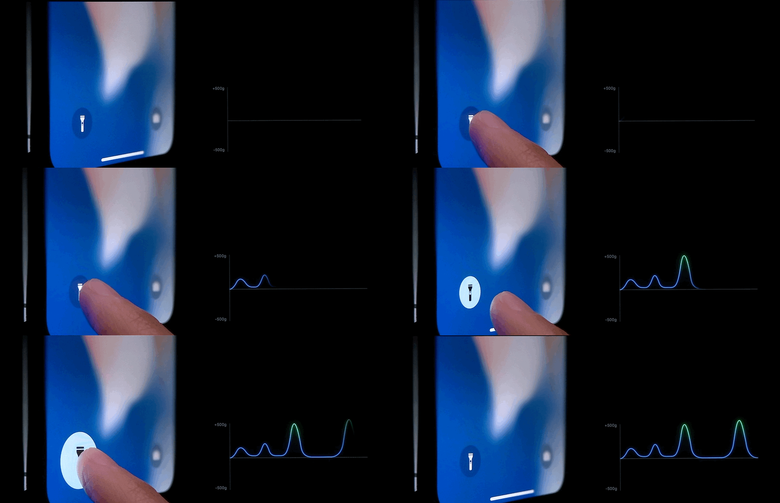
How can we detect this pause in Motion ?
Answer: Vertical Finger Acceleration
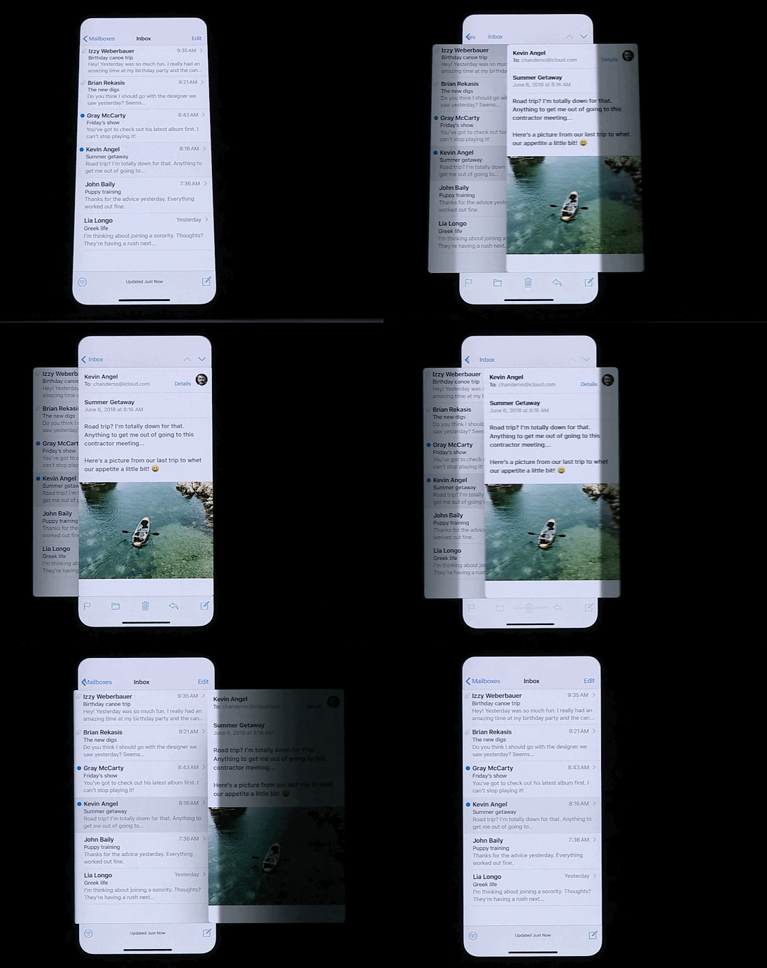
Maintain spatial consistency throughout movement
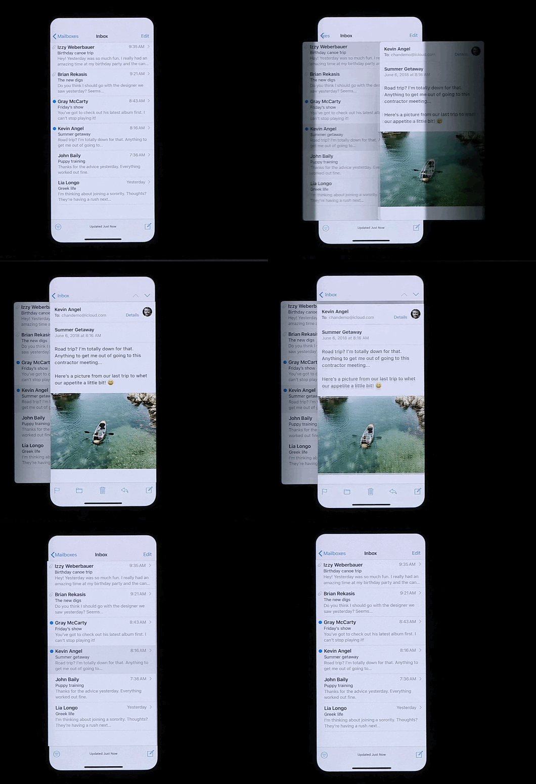
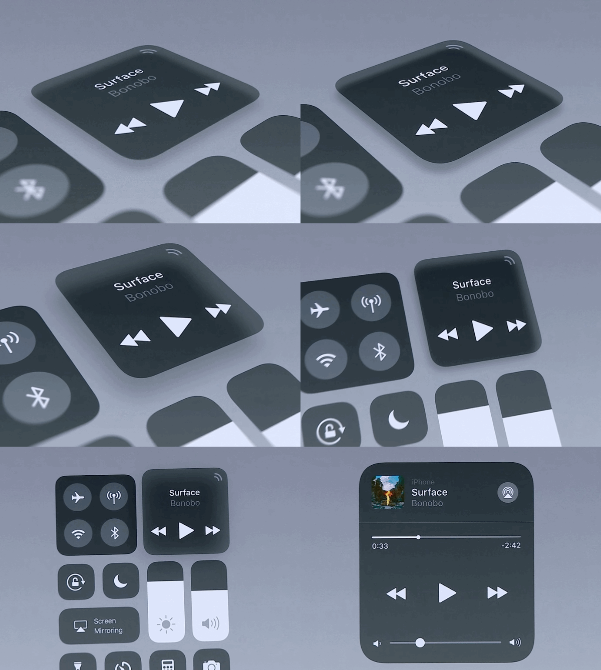
Hint in the direction of the gesture
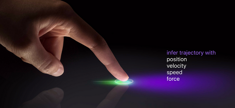
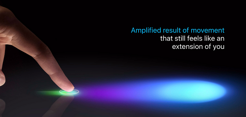
Keep touch interactions lightweight but amplify their motion
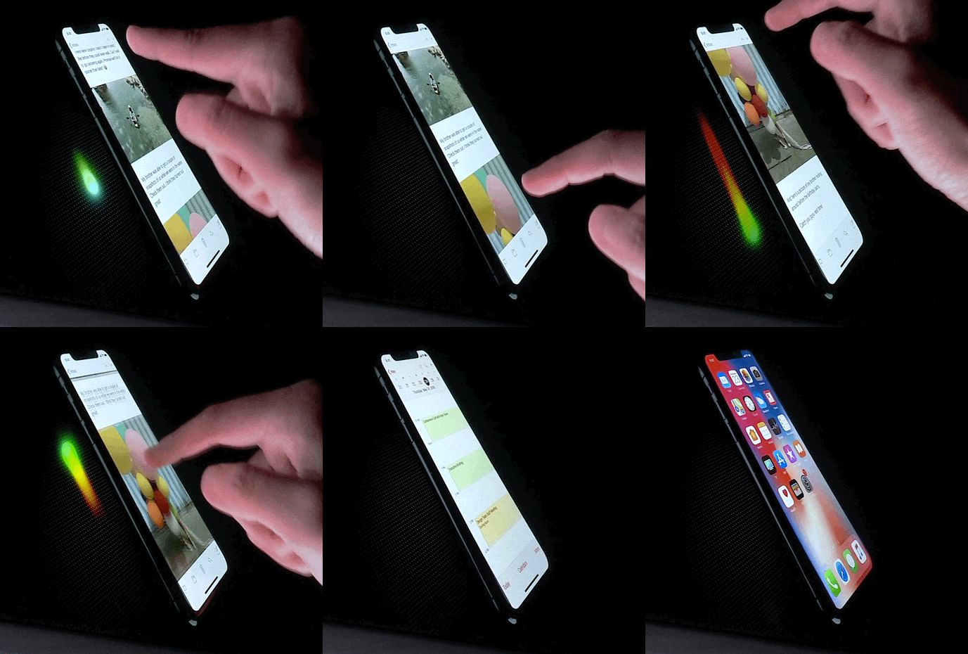
Softly indicate boundaries
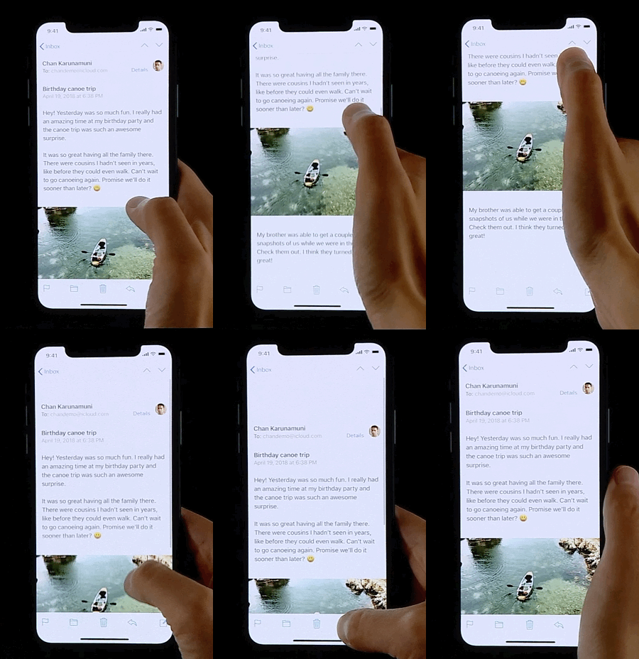
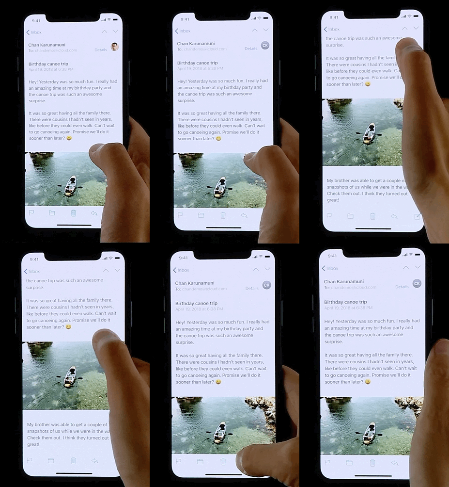
Soft transitions
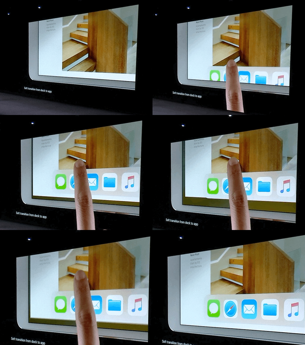
Design smooth frames of motion
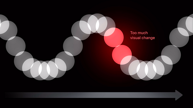
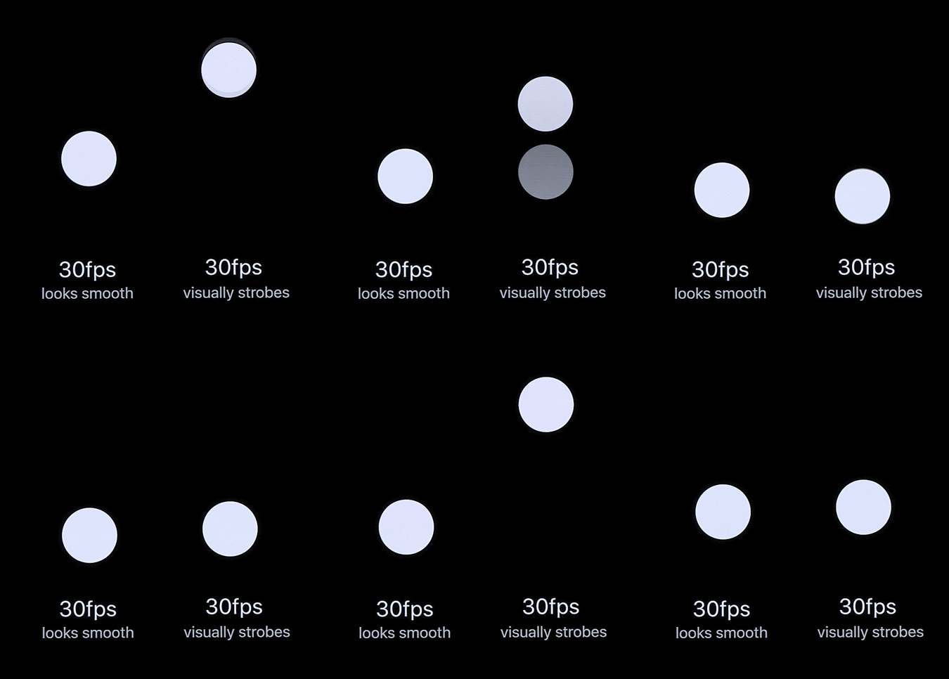
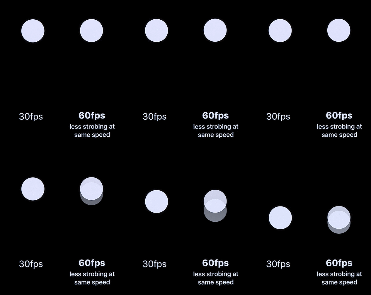
Tips in low FPS
Make animation look smooth
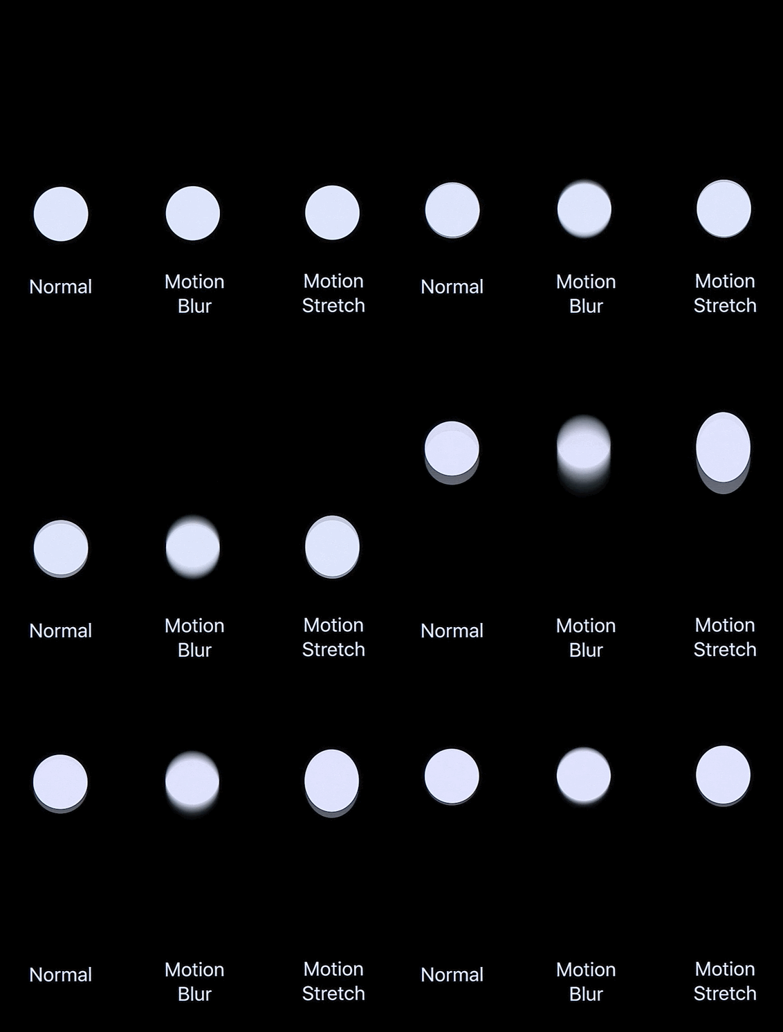
Work with behavior rather than animation
Make things feel connected to you
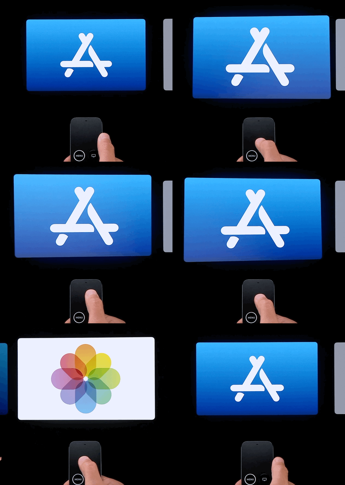
- In Photos, there’s less mass on the photos. It’s conceptually lighter
- When you swipe apps, there’s more mass on the apps. It’s conceptually heavier.
Give more mass to the system
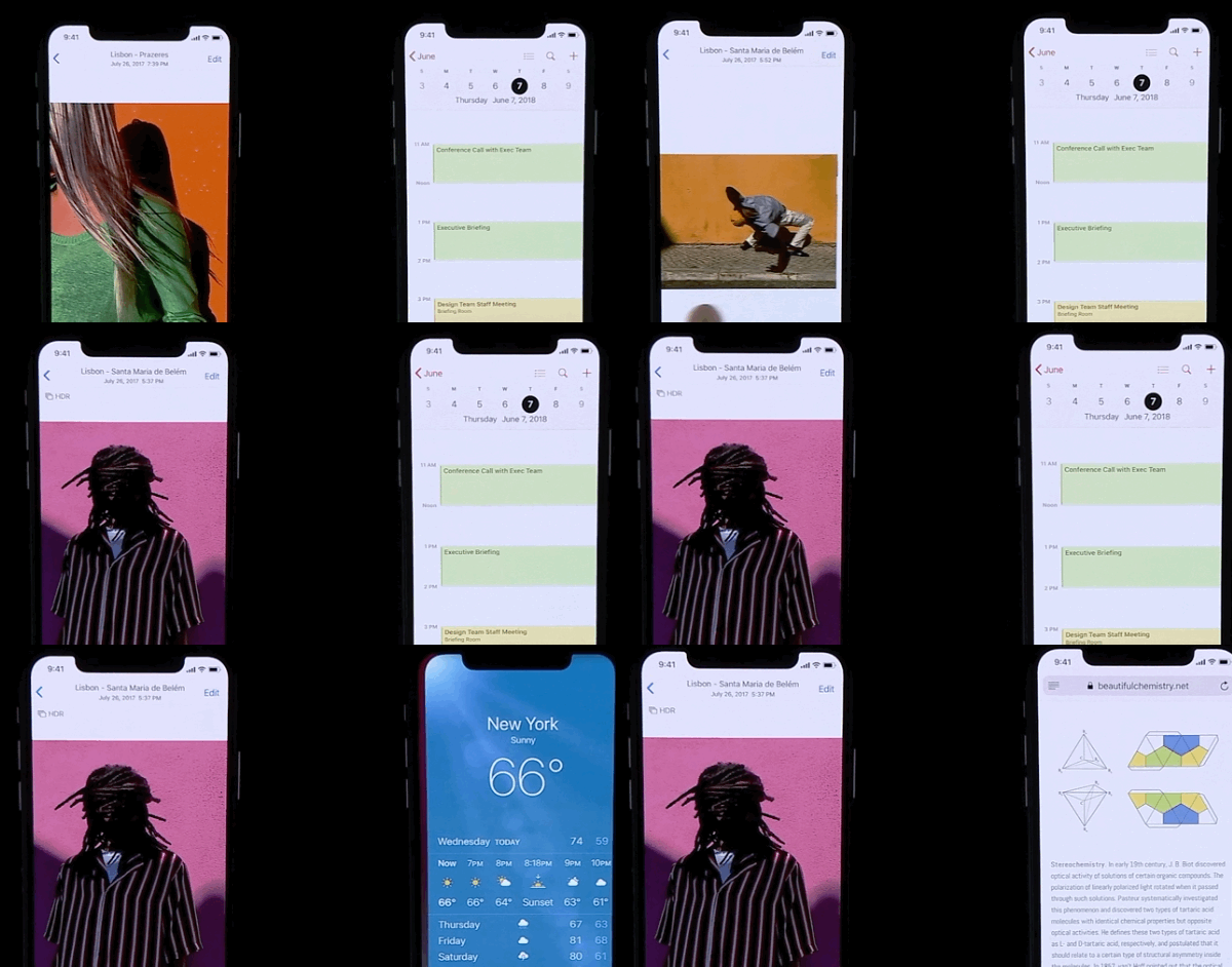
Fluid Interfaces Think Like Us
Summary
- Instant response and constant redirection
- Maintain spatial consistency
- Hint in the direction of the gesture
- Lightweight interactions, amplified output
- Soft boundaries and transitions
- Design smooth, dynamic behavior
Designing with dynamic motion
- Seamless motion
- Crafting a character
- Understanding intent
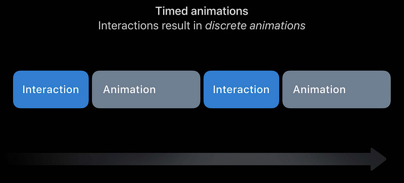
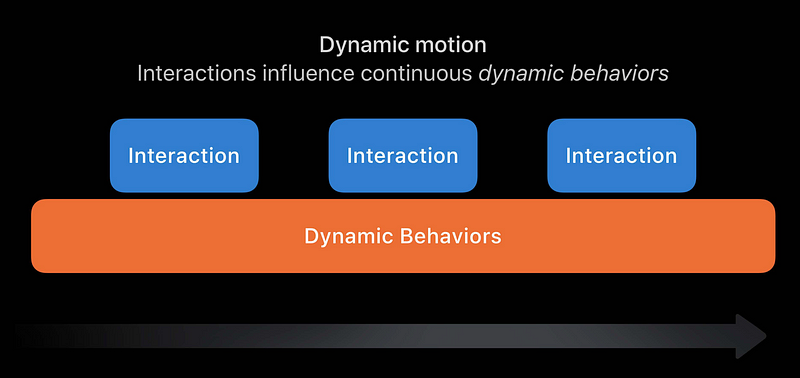

Seamless Scrolling
- Familiar, natural motion
- Maintains throw momentum
- Friction gracefully reduces speed
- Imperceptibly comes to rest
Damping
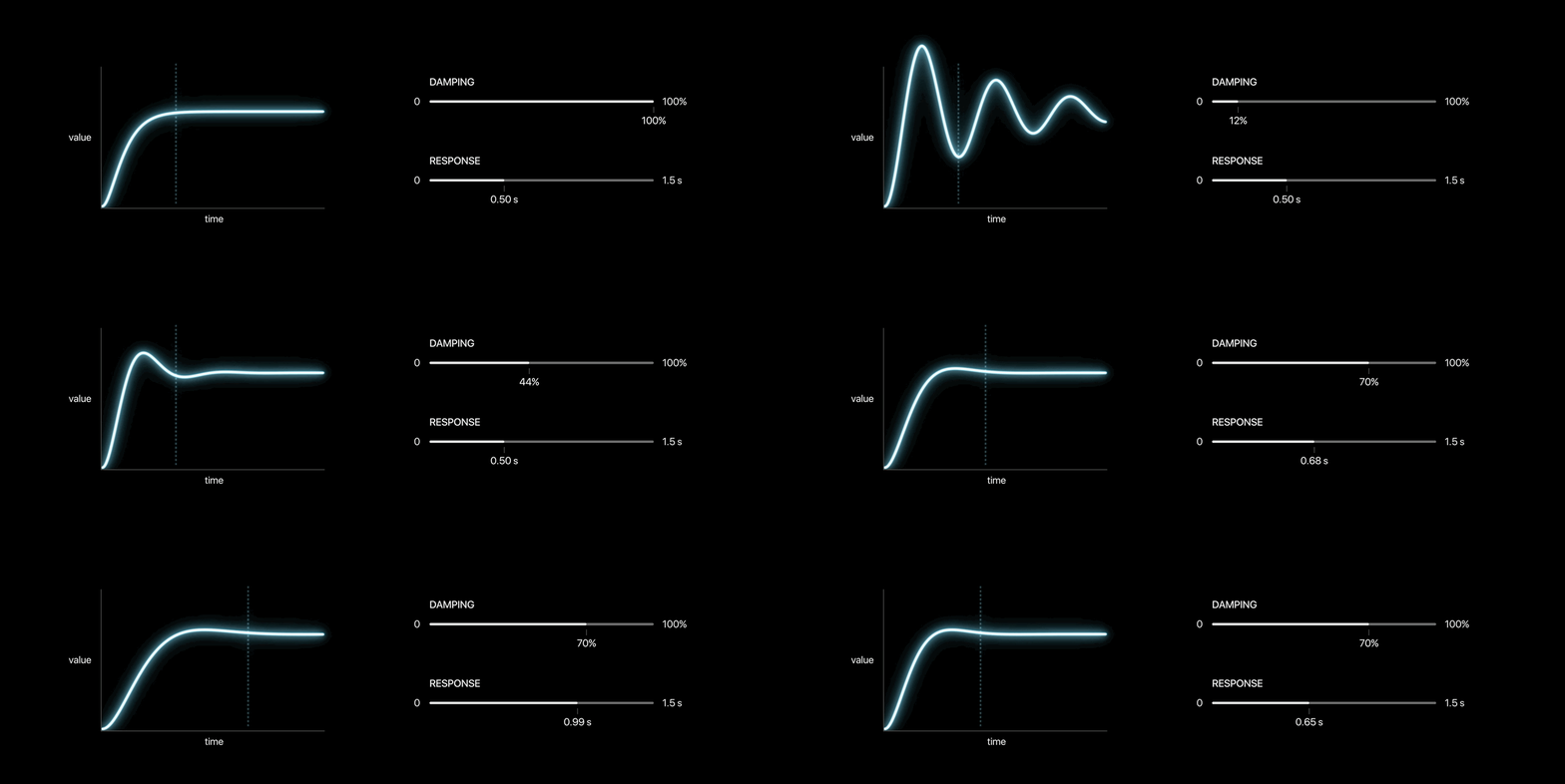
Start Simple, not springy
Example: Send a mail
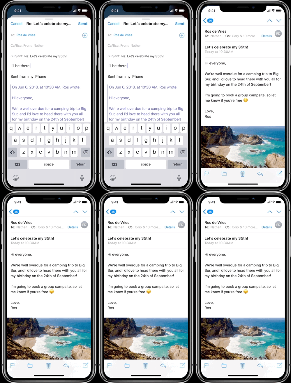
Reward momentum with overshoot
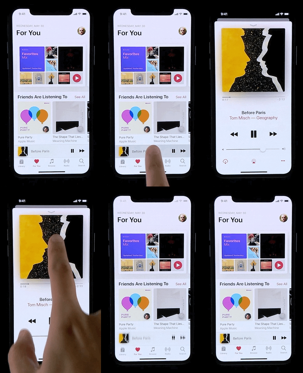
Bounciness can hint at a little more
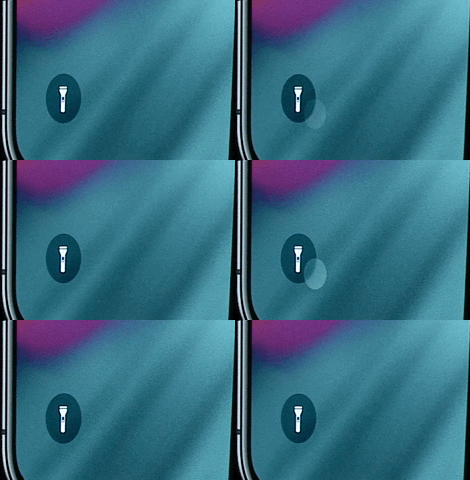
Think beyond motion
By combining dynamic behaviors for motion
with dynamic behaviors for sound and haptics.
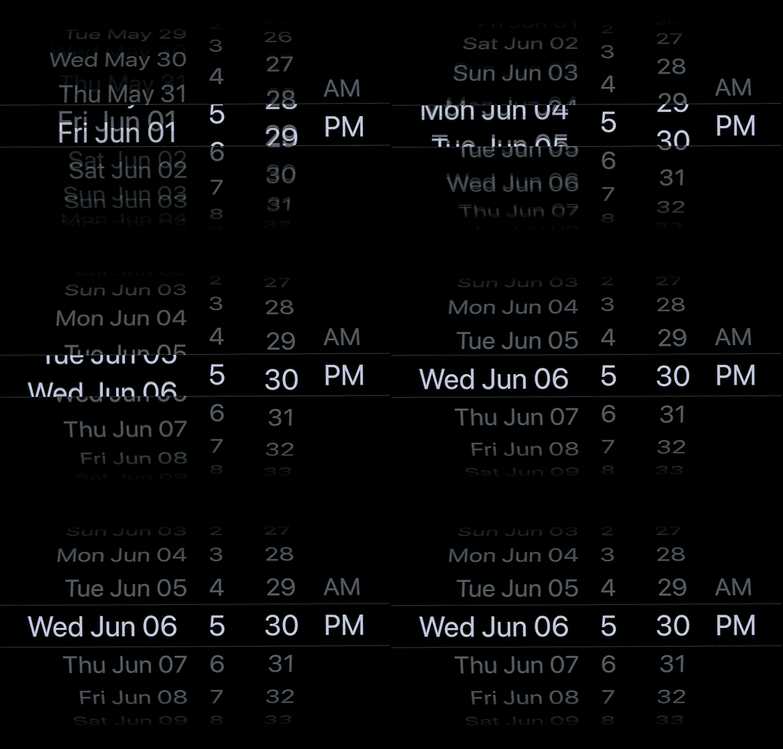
Stay in character
Once people learn one behavior of your app, they can pick up another behavior really easily, because we learn through repetition
Intent is expressed through motion
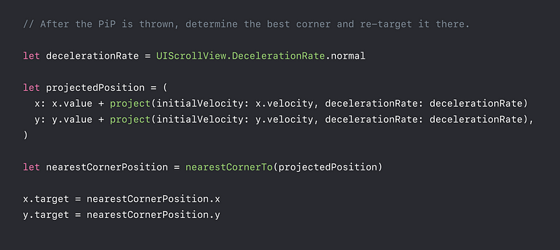
- Issue: When we’re only looking at position. We’re completely ignoring the momentum of the PIP, and its velocity when it’s thrown.

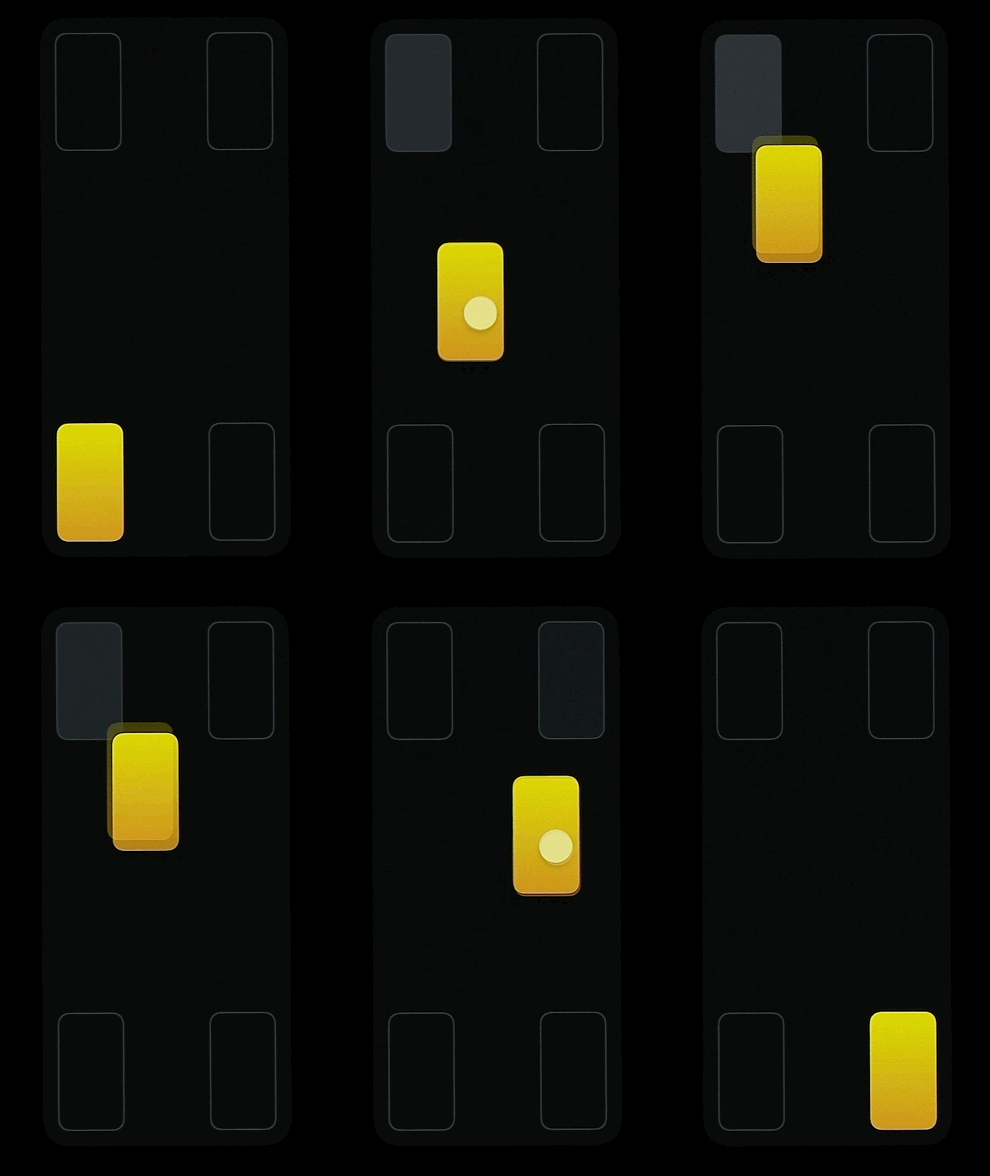
- How can we incorporate momentum into deciding which endpoint we go to ?

Designing with Dynamic Motion
Summary
- Continuous behaviors, not timed animations
- Draw inspiration from the physical world
- Springs don’t need to be springy !
- Align motion with intent
Responding to interaction
- Design of taps and swipes
- Principles of fluid interactions
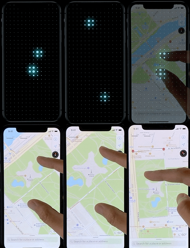
- Dealing with multiple gestures
Designing a tap
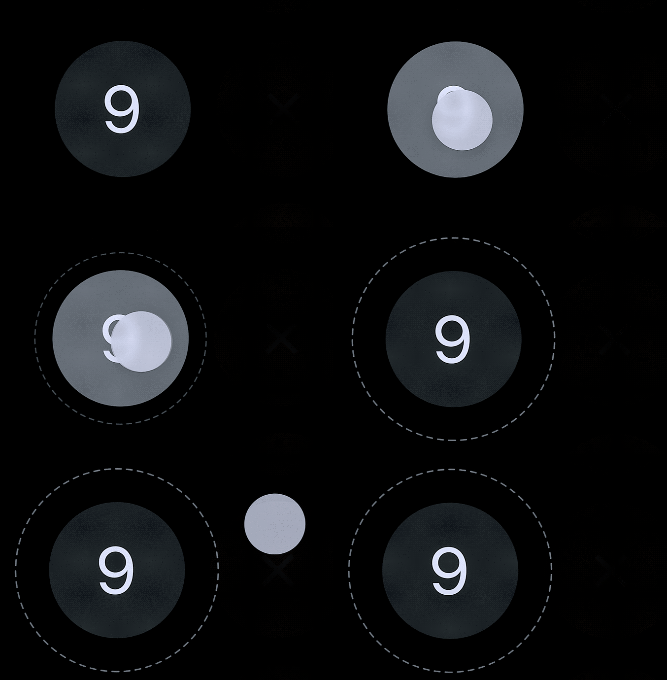
- The button should highlight immediately when user touches down on it.
- Create an extra margin around the tap area
- If user drags finger outside the tap area, and lift it. User can cancel the tap.
The Same way, if user swipes it back on the button, the button should highlight again.
Designing a swipe
- We learn to differentiate swipes from other gestures
- The distance is called hysteresis

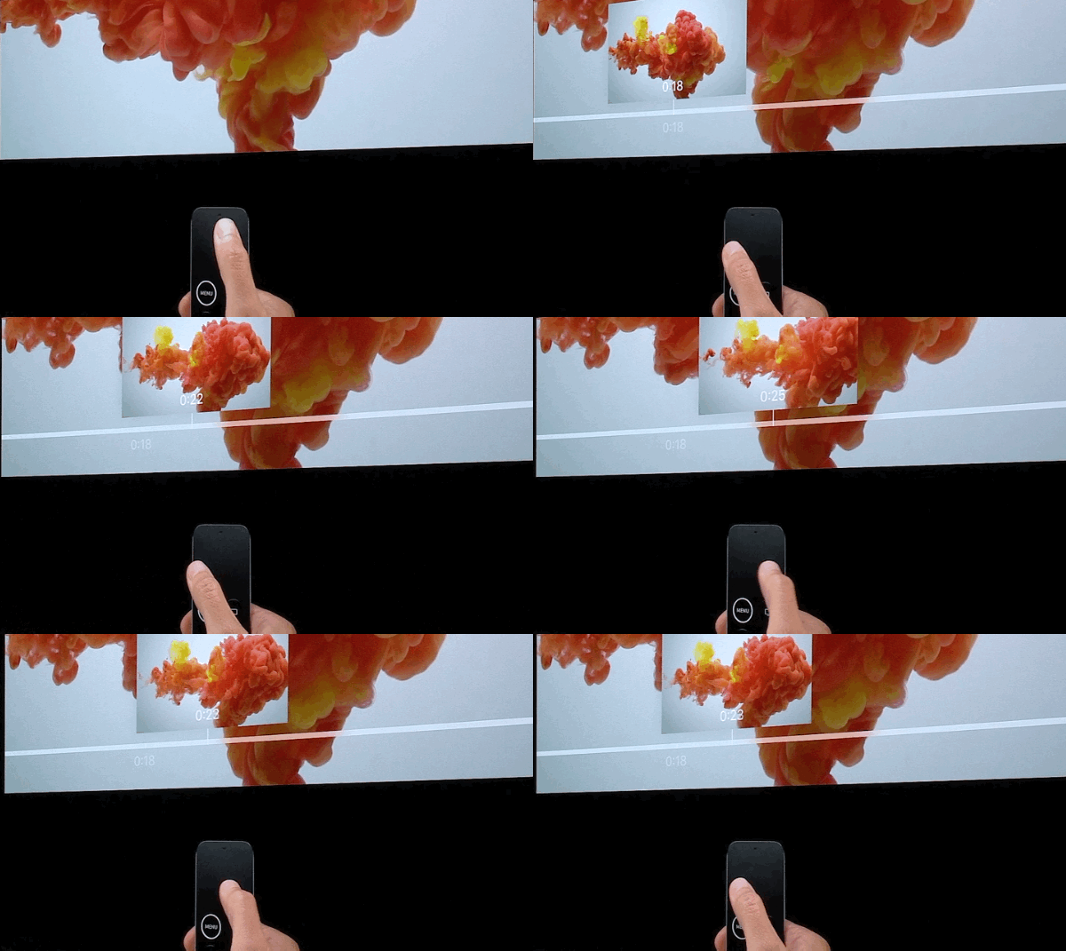
Touch and content move together
When swiping or dragging, the contents should stay attached to the gesture.
This is one of the principles of iOS
Provide continuous feedback
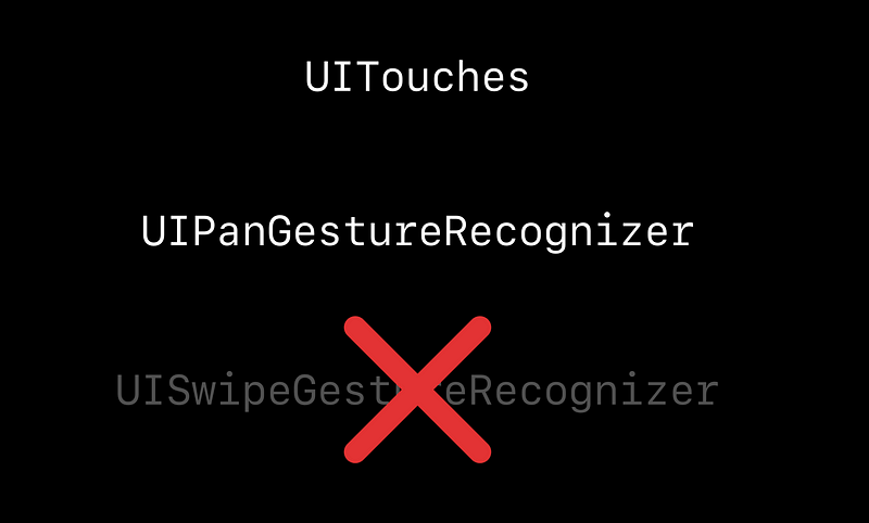
UIPanGestureRecognizer ⚠️
- When implementing your gestures,
you should avoid methods that are only detected at the end of the gesture, like UISwipeGestureRecognizer. For fluid experience. - Your interfaces must respond to more than 1 gesture.
Combining gestures
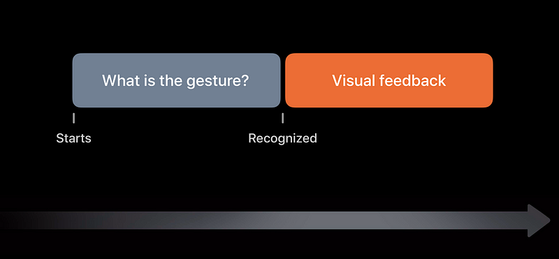
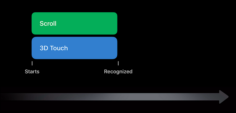
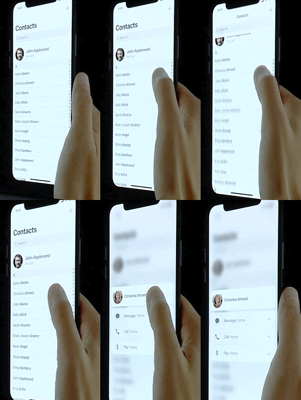
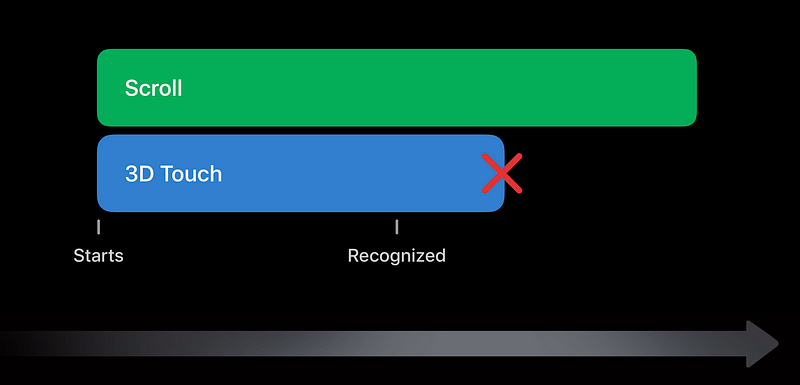
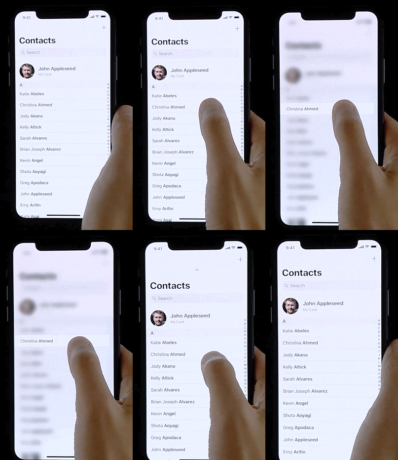
Taps are delayed because of double-tap
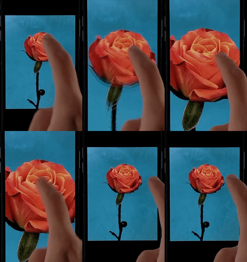
Responding to Interaction
Summary
- Design of taps and swipes
- Content and touch move 1 to 1
- Provide continuous feedback
- Detect multiple gestures in parallel
Fluidity as a medium
- Teaching
- Visual Cues
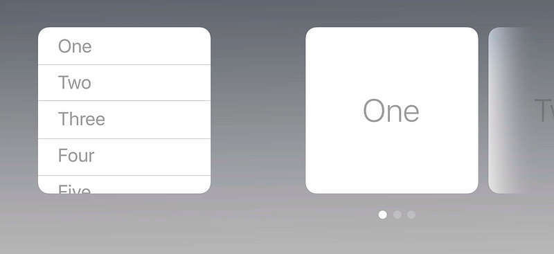
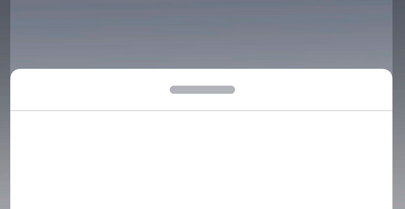
Elevate interactive elements to a separate plane
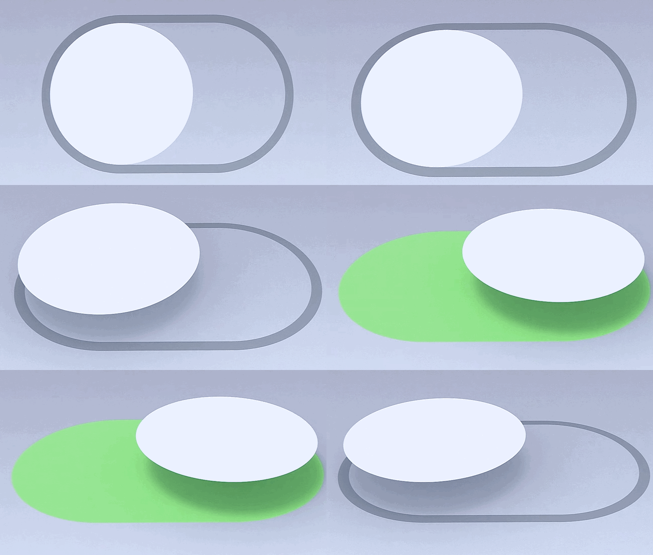
Use behavior to teach gesture
- It’s best when you have 1 gesture that’s used repeatedly in a bunch of places, and you explain it once up front, and then you just keep using it.
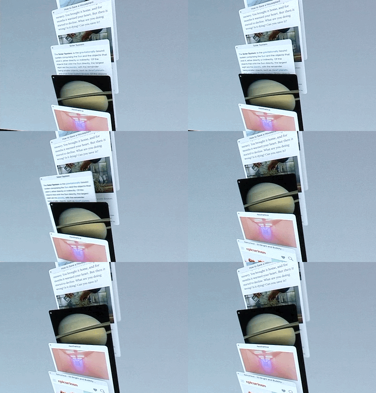
Explanations
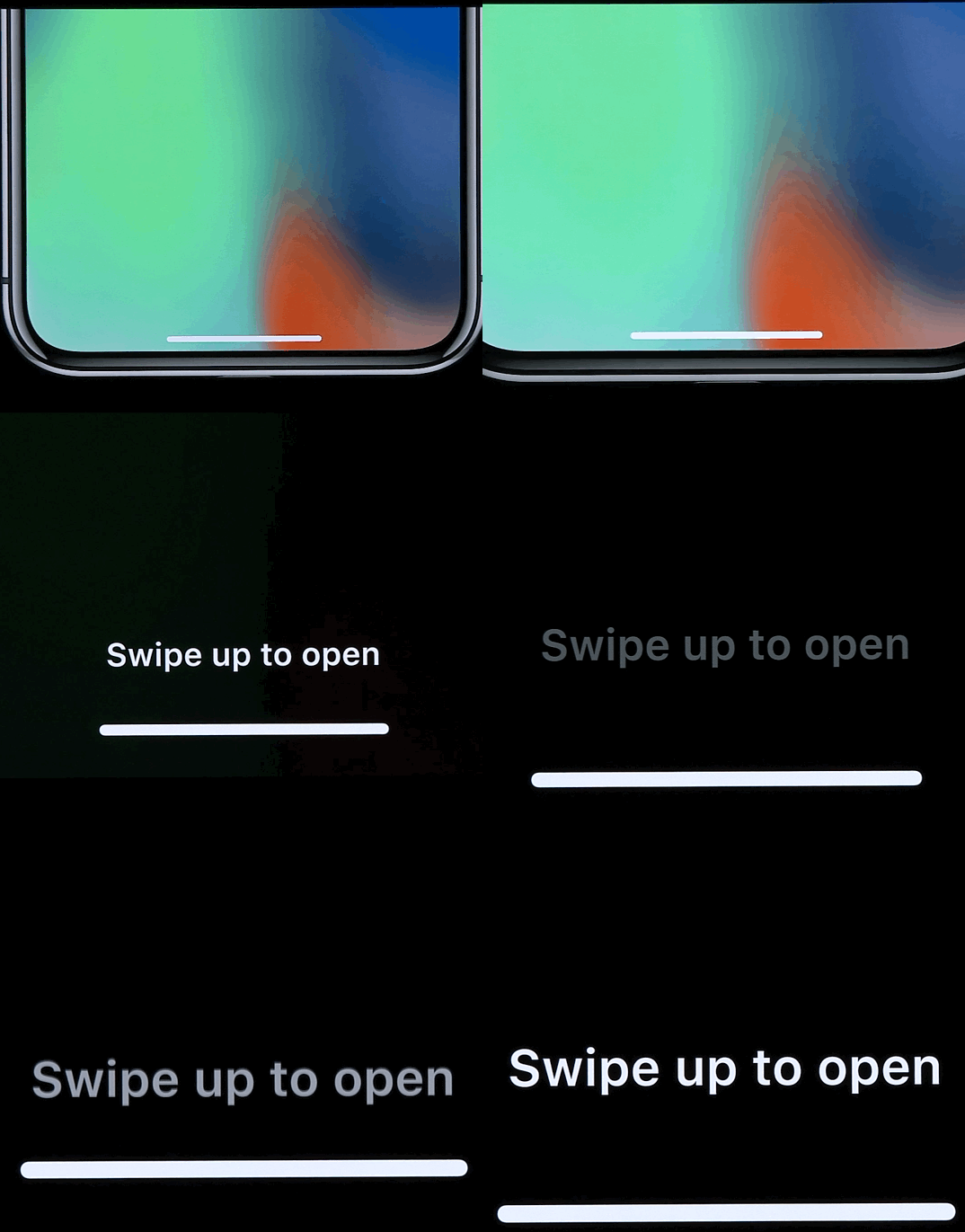
Playfulness
- A natural consequence of a fluid interface
- Happens when the interface feels in sync with you
- You feel comfortable exploring new ares
- Allow people to discover your interface through play
Fluidity as a Medium
- Design the interactions to be inseparable from the visuals
- A interactive demo is worth a million static design
- Prototyping helps you think by exploring
- Sets a goal for the implementation
- Hard to copy and gives your app a unique character